You know your organization’s website needs to be attractive, modern, and display correctly on mobile devices. But is that all it takes to have a good site?
Although website aesthetics are certainly important, a website must have both form and function to be effective. Your website should be easy for visitors to use and understand. It should provide the right information at the right time, and without requiring too many clicks to navigate around.
When you work with Fishers of Folk Digital Design, we take both the form and function of your website into account. In this post I will break down 5 essential elements to achieving both.
Table of Contents
1. Know Your End Goal
The first must-have is to know the end goal of your website. In other words, you should have a clear understanding of what measurable outcomes you want to achieve.
This may seem obvious, but you would be surprised by how often websites, apps, etc. get created for an organization without considering why they need one. And “because everyone else has one” is not a good reason.
For churches, your end goal is probably to make it easy for guests and members to attend services and other events.
For nonprofits, your end goal might be to convince prospective donors to support your cause. However, it might be even more important for your site to schedule volunteer shifts or provide donation instructions.
For small businesses, your end goal at a high level is to sell your products and services, but you should also have a more specific goal:
For example, if you have a restaurant, your end goal might be to get table reservations. If you don’t take reservations, it might be to sell orders through a food delivery service like Grubhub or DoorDash.
If you have a shop that sells physical merchandise, it might be to have customers place online orders for delivery. If you don’t sell online, then your website could primarily be to convince people to come to your store.
If you have a construction business, your end goal might be to schedule on-site consultations. But it might be to sell standard packages or services for which no consultation is needed.
You will most likely have a primary end goal and one or two secondary goals for your website. Write them down; they are important. The entire design of your website should support these goals.
We’ll look at how to apply form and function to support your end goal in the following sections.
2. Invite a Specific Action
Now that you know the end goal of your website, we want to make sure your site visitors do as well. You can accomplish this with a call to action (CTA) that tells the visitor what you want them to do.
Consider the following statements:
Plan your visit. Support our cause. Make a reservation. Order online. Book a consultation.
All of these are a clear invitation to take a specific action. The reader knows immediately how to move the process forward.
You want to avoid a situation where the site visitor wants to become a guest/donor/customer/etc. and can’t figure out how. Instead, make it as easy as possible for them.
Your primary CTA should not normally be to “Learn More.” Ultimately, you do not want your site visitors to merely learn about your organization. You want them to attend programs, buy products, place membership, etc. Direct them to take this action.
Example: Too Many CTAs
The website for Common Pantry has an image slider of four different calls to action on its homepage. There are a couple different issues with this.
First, it is not clear what action they want site visitors to take. Should I learn more about the new location, watch an inspiring story, learn more about distribution days, or learn more about how they’ve been serving neighbors for 50 years? If I’m visiting this site to volunteer or get food, it is not clear how to move forward.
Secondly, the motion of the slider is extremely distracting. The general consensus is that sliders are bad for conversion rates because they split attention and provide a negative user experience. This is especially true when sliders play automatically and cannot be paused, as is the case here.
Assuming that most visitors to the Common Pantry website are looking to volunteer, I would replace the image slider with a single photo of the pantry and a CTA button that says Become a Volunteer.
The navigation links in the Common Pantry website are very clear and well-organized. This gives us a nice segue to—
3. Keep It Simple
Keep your site layout and navigation simple for maximum engagement with your site visitors.
Your navigation menu is a powerful tool to direct site visitors to key information. It is also a common pitfall that can easily lead to disorganized and confusing sites.
Here are a few best practices for an effective navigation menu:
- Limit your top menu to 7 links or fewer.
- Put the two most important links in the first and the last spaces. The middle links are more likely to be skimmed over.
- Use language everyone understands.
- Only use buttons in the navigation for CTAs (such as Join or Donate).
- Do not put social links in the top navigation.
- If you need a more detailed map of all the content in your site, put this in the footer.
For the rest of the site layout, use the “less is more” philosophy. Place ample space around important content so that your site visitors can focus on it. Use consistent patterns to make information easier to understand.
Don’t forget to make the visual design of your site accessible to all site visitors. Use high color contrast, simple fonts, and add alternative text descriptions to images.
If you decide to animate website elements, keep this to a subtle minimum. In addition to possibly triggering seizures, rapid animations can cause motion sickness in sensitive persons (such as yours truly).
Finally, if any content does not support your 1-2 primary end goals, consider removing it completely.
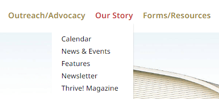
Example: Unclear Navigation Labels

The above screenshot is taken from the Episcopal Diocese of Chicago website. Do all of these navigation items belong together? Do any stand out to you as out of place?
When I moused over Our Story, I expected to see a list of pages with titles such as About, History, Our Leaders, and other story-like topics. Since the actual submenu pages seems to be about recent and upcoming events, I would relabel the top navigation menu item to be Events.
Additionally, the submenu item Features initially confused me, because I normally understand that word to mean product capabilities or attributes but here it means lengthy news stories. I would rename this item as News Features.
Try to think from an outsider’s perspective when labelling your navigation links.
4. Show More Than You Tell
Okay, I’ve been guilty of this myself.
When you have an organization, product, or event that you are passionate about, it can be easy to over-explain it. It can be tempting to write large blocks of text that describe in minute detail everything there is to know about this subject. After all, it’s extremely interesting!
At least, it is to you. Unfortunately, most of your site visitors will feel differently.
The simple truth is that your site visitors are most interested in what value you are offering them. They want to know what you have, how they can experience it, and what it costs.
Use images to illustrate your products and services, and reduce any text to the most important information. This is especially true on the homepage because it is your best opportunity to direct your site visitors to the action you want them to take. Don’t weaken your message with distracting details.
It’s okay to include lengthy text on your History or About page. However, still ensure that you are writing for your target audience and that you are reinforcing your top 1-2 website goals.
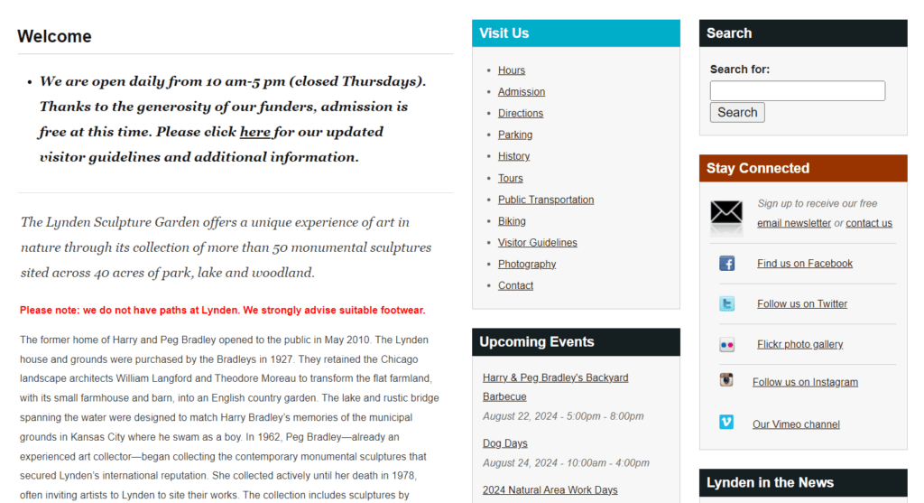
Example: Information Overload

This screenshot is from the Lynden Sculpture Gardens website. The primary goal of their website is mostly likely to persuade people to visit their gardens. Do you think they are achieving their goal?
What stands out to me most on this page is the red text that warns visitors that they do not have paths and to wear suitable shoes. This is not the most inviting message.
Before all of this text their homepage does display a slider with images of the sculpture gardens and different events that they host. However, rather than providing a clear invitation to visit the gardens, the slider introduces confusion about what the main attraction actually is.
I would replace all of this with one photo that illustrates what visitors can expect at the sculpture garden. This would include a CTA button to Plan Your Visit that links to a page with additional details.
Below this, I would create a section called Upcoming Events with photos of the specific events in the slider. I would include a link to each event and a button to View the Calendar.
I would completely remove the history of the sculpture garden from the homepage and move it to a History page. Anyone who is interested in this information will find it.
5. Check for Errors
As you create and revise your website, ensure that you occasionally review that both the visuals and functionality are working as expected. Editing mistakes and software updates can both contribute to errors in your webpages.
If something isn’t working on your site, you might not notice immediately, but your site visitors will.
Schedule a digital marketing review to help identify these errors (and other opportunities) on your site.
Here are a few common items to check for:
- The primary CTA on your home page 1) can be clicked and 2) goes to the desired page.
- Menus and links are easy to view and click, especially on mobile devices.
- You are not linking to any admin screens or other pages that require authentication. You can test this by viewing your site in a private or incognito browser window.
- All images and videos are loading correctly.
- All of your forms work and store responses as expected. If you expect to receive an email, test that you really do.
Example: Broken CTA
At time of writing, one of the sites I shared as an example has a CTA button on their homepage that does not work.
I have already been a little tough on these sites and don’t wish to call them out further. Suffice to say that any site can have errors—even mine. Even yours. It takes discipline and attention to detail to thoroughly review that all aspects of a site are functioning as expected.
Don’t let your site lose its audience just because you forgot to add a link to a button.
Form and Function of Your Site
An appealing, effective website does not need to be flashy or complex. With high quality images and a clean layout, you can achieve form. By prioritizing the most important information, you can achieve function.
Everything goes back to the end goal of your website: use this to help prioritize your information. Ensure the aesthetic design supports your overall goal without being distracting.
By following these 5 essential steps, you are well on your way to establishing both form and function on your organization’s site.
Want more tips tailored for your website? Get started on your journey to form and function today.


